Are you aware of how successful a banner stand can be? Whether you are exhibiting at a trade show or exhibition, setting up an information point in your reception area, or advertising new products or services in your store, a banner stand helps draw attention and increase brand awareness.
But the crucial point is – your banner stands and popup stands must be well-designed. A highly visible form of marketing such as the banner stand can act against you if it is poorly designed and badly printed. Banner printing takes some planning and forethought. Here are some ideas for how to design a more effective banner that will help to develop your brand and your presence.
1. Think “Less is More”
No one is going to have the time or inclination to examine a long, complex message on your banner stand. Banners are normally used in places of high traffic where people spend a few seconds taking in your message. Your message, therefore, needs to be extremely clear and to the point. Use as few words as possible and make a big impact with powerful images.
2. Important at the top
The most important and crucial information should be at the top of the banner as this will be seen first. This is the place to put your logo and your company name as well as the essential information you want to promote on the banner. Other information can go lower down as people will read this later. Don’t compromise on your most important marketing message when designing a banner.
3. Choose your headline with care
The short and snappy headline draws people in and demonstrates why they should stop and consider what you are offering. You need to think about what to write that will immediately transmit your message, and how you are going to say it. It should be short enough to convey the right message.
4. Pick careful colours
Colours must fulfil a variety of functions, from keeping in line with your brand image to allowing your banner to stand out from the crowd. It is important to consider the emotional and psychological effect colour has on your viewers as well as what it actually looks like. Your brand colors should match your banner colors.
5. Only use relevant images
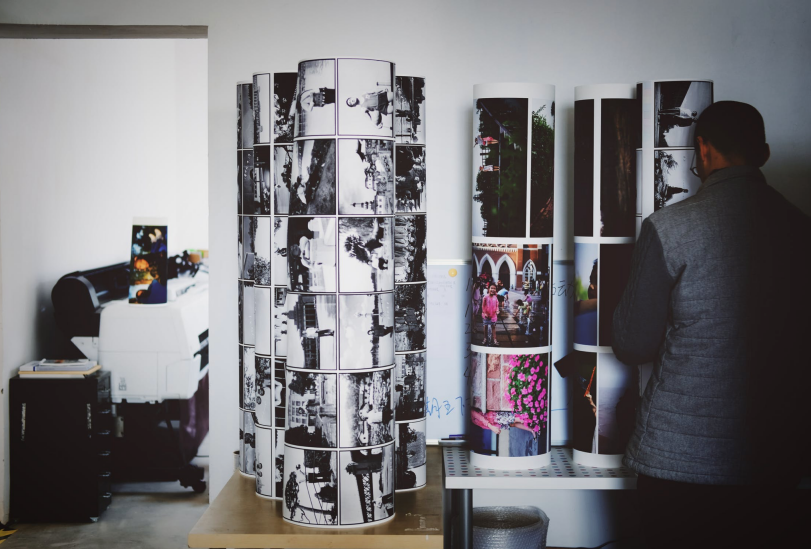
People assume that any image is better than no image, and in some cases banners can look strange and irrelevant because of the image chosen. Images should be high quality and tie in with the overall message conveyed by the banner. Remember that images will be enlarged so you should always use the appropriate image size when designing your banner and sending it to be printed. Take your own photos where possible since this will avoid giving your banner a generic look.


1 comment
nice!
Comments are closed.